Wrapped in Glorious Nonsense: Britain’s Chip Shop Signs as Accidental Art
There is a particular shade of seaside blue that exists only on the front of a fish-and-chip shop. It is usually applied with optimism, occasionally with a roller, and almost always next to a window sticker announcing that card payments are accepted “over £5”. The British chippy is many things — a Friday ritual, a coastal beacon, a place where the word “small” is purely theoretical — but it is also an accidental gallery of graphic design. Owl’s Pics has come to praise the signs, not to snigger at them. Well, mostly.
First, an admission about Helvetica
We are not here to claim every chip shop sign is a lost masterpiece. Some are. Others look as though a printer cartridge exploded in a wind tunnel. But that is precisely the joy. The chippy frontage is one of the last unregulated corners of British typography, a place where Comic Sans can share a fascia with gold-shadowed serif capitals and a neon fish that appears to have been wired by an enthusiastic amateur. There are no brand guidelines. There is a budget, a landlord, a council sign policy and the weather. Somehow, from this chaos, a visual language emerges.
It is a language of salt, vinegar and mild panic. It says: we have been here since 1962, we are open, we do mushy peas, and yes, the queue is out the door. Graphic design gold, in other words, is often just graphic design that has been left alone with a laminator.
The taxonomy of the British chippy sign
After far too many coastal walks and an unhealthy number of photographic detours, certain types keep surfacing. First, the Heritage Hand-Paint: gold lettering, a shadow effect, possibly a subtle nautical flourish, and a proud “Est.” date. It projects the quiet confidence of a place that has never needed a QR code.
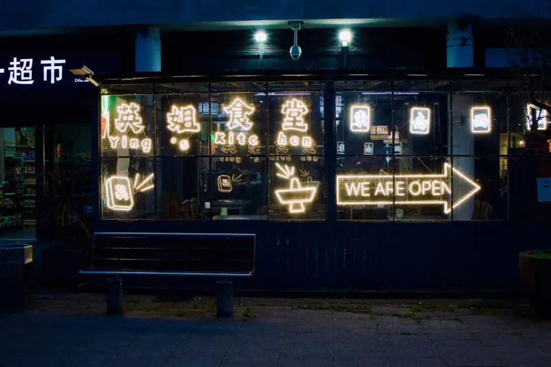
Then comes the Neon Cod. This is the chippy sign that has decided a fish is not just a fish but a character, often mid-leap, occasionally wearing a top hat. At dusk, it glows with the solemnity of a lighthouse and the colour palette of a 1980s arcade. If one letter is flickering, all the better. Noble decay is part of the charm.
The Menu Board of Chaos is a genre unto itself: magnetic letters arranged with the typographic discipline of a ransom note. “COD & CHIPS” is clear. “PEAS” has gone rogue. A lone apostrophe hovers near “Sausage’s” like a wasp at a picnic. The overall effect is jazz typography — improvisational, slightly alarming, and somehow more memorable than a perfectly kerned corporate menu.
And then there is the Defiantly Modern. A sleek grey fascia. A minimal sans-serif. Perhaps the word “FISH” in lowercase. It looks suspiciously serene, as if the shop is trying to distance itself from the glorious batter-scented mayhem inside. Helvetica on a chip shop is a brave choice. It says: we have a website and a cousin who works in branding. It rarely lasts. The sea air gets to it.
Why wonky signs beat polished branding
The best chippy signs are unguarded. They are local pride made visible, usually in vinyl. They tell you where you are: a seaside town where the wind has views on your hairstyle, a market square, a suburb where the Friday queue is a social event. They carry nostalgia without trying. A hand-painted name in peeling gold can summon memories of sand in your sandwiches and seagulls with a sense of entitlement.
They also reveal Britain’s weird relationship with typography. We are a nation that will tolerate a misplaced apostrophe for forty years if the cod is good. We will accept a cartoon fish in sunglasses. We will queue beneath a sign that promises “FISH & CHIPS” in three different fonts and one unexplained lobster. This is not laziness. It is local visual culture, shaped by weather, budgets, and the fact that nobody has ever called in a brand consultant to a chippy on a wet Tuesday in Cleethorpes. Long may it remain so.
How to shoot a chippy sign without becoming the villain of the queue
A few practical notes from the Owl’s Pics field kit. Shoot at opening time or mid-afternoon, when the lunch rush has thinned and the staff are not performing batter-based miracles at speed. Stand on the opposite pavement if you can; a 35mm or 50mm lens gives you the whole frontage without looing too paparazzi. If you want the menu board, use portrait orientation and get close — but ask first if you are leaning into the doorway. Never block the pavement, never stand in the queue with a camera raised like a traffic cone with ambitions, and never photograph customers’ faces without permission. If the queue is long, come back. The sign will still be there. Probably.
At night, neon comes alive, but flash is the enemy of atmosphere. Brace against a wall, use a phone’s night mode, and let the glow do the work. Look for reflections in wet pavements and windows. Include context: a seagull, a stack of salt shakers, the edge of a bin. The sign is the star, but the street is the supporting cast. And if you find a genuinely perfect Helvetica fascia, photograph it quickly. It may not survive the winter.
The cheeky ranking
- Neon cod with one flickering letter — noble decay, maximum atmosphere.
- Hand-painted gold name with shadow effect — nautical confidence, zero irony.
- Menu board with mismatched magnetic letters — jazz typography at its finest.
- Cartoon fish wearing any hat — unhinged mascot energy.
- Minimal Helvetica on grey — suspiciously serene; approach with caution.
Last bite
Britain’s chip shop signs are temporary, weather-beaten and frequently ridiculous. That is exactly why they deserve a photograph. They are not polished. They are not consistent. They are a Friday night in visual form. So next time you are by the coast, or in a town where the chippy glows like a small, salty beacon, take a second look at the frontage. Then order a large cod and chips, because the queue is moving and you are holding up the salt and vinegar.